I love so much.
While the closets are small, the bedrooms are large. And while the bathrooms are small, the dining room and living room are huge. And really, how many clothes does a person need and how much time should they be spending showering or on or near a toilet? The master bath at our house in San Diego was the same size as one of the children's bedrooms, which were small.
So why waste square footage on bathrooms and closets when you can instead, apply that square footage to livable areas? At least, that's the logic that I believe was in place when this house was constructed 50-years ago and it's the same line of logic that I am trying to embrace, now.
(As I try to optimize the closet space I share with my husband and figure out where to store my toothbrush so it won't fall in to the commode.)
When I was walking through this house for the first time, I was struck by the fairly good size and nice shape of the dining room. The dining room in our San Diego house, was part of the same room as our living room. The only thing that set the dining room apart from the living room, was a chandelier that was suspended from the ceiling. But had that chandelier not been there, you'd never have guessed that the two areas were supposed to be separate spaces.
I never liked that configuration, which is why I moved the dining room in to what was our family room, and combined our family room with our living room.
The problem that I found with that one-big-room dining/living room arrangement, was that the dining area was so small, whenever we'd have a dinner party, people would hit the walls and windows when they were pushing their chairs back from the table. Usually, if someone wanted to stand up, the person sitting on the opposite side of the table would have to pull it towards them so that person who was exiting wouldn't knock pictures clear off the wall.
And if we ever decided to put a leaf in to expand our seating area?!
The table would stretch in to our foyer.
Yes, I know there is world hunger and disease and a lot of other troubling things in this world, but it would bother me IMMENSELY that our dining room table would damn near hang out the front door if we had a dinner party for eight.
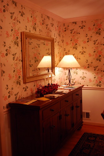
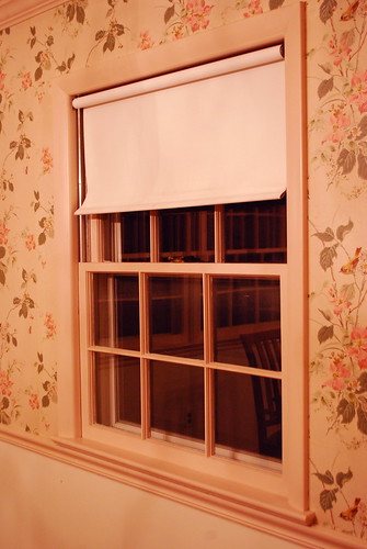
In our new house, there is an area, directly off the kitchen that is unequivocally and largely designed to be a stand-alone DINING room. I absolutely love it, because it's the exact kind of dining room I've always dreamed of having, what with beautiful hardwood floors and windows
overlooking the wooded backyard.
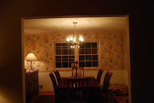
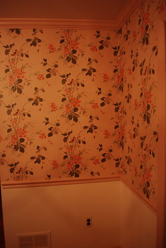
(Although the soft rosey pink finch and butterfly wallpaper, with matching soft rosey pink chair rail, baseboards and crown moulding definitely weren't in my dream. Apologies for the poor photo quality. I really must remember to take these "before" photos during the day when there is lots of good, natural light.)
While I don't think it will take us long to get the dining room finished, we have so many other things to tackle first. But in preparation for tackling the dining room - which we hope to have completed in time for Thanksgiving - we're currently debating our color scheme and chandelier replacement. (Maybe this one. Or this funky looking one?)
We definitely want to paint the baseboards, chair rail, crown moulding and all the window trim white. We also definitely want to do some kind of two-tone with color.
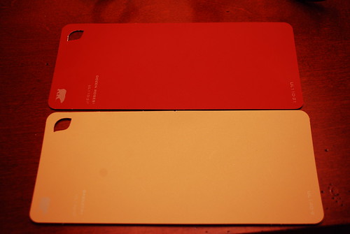
Perhaps we'll do a deep red on the upper, with an oatmeal or sand color on the lower which I think would compliment the rug and cherry furniture we have in the room.
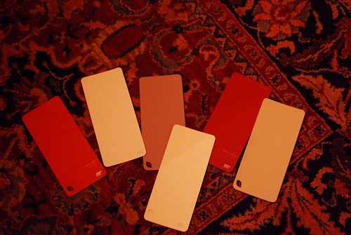
(Again, apologies for the horrible photo quality. Note to self: do! not! forget!! must take pictures in DAYLIGHT!)
We're also debating the curtains we want to use. Because I spent a small fortune on these drapes a few years ago, and I love them more than words, they did not convey with our San Diego house. So now, I need to decide whether I want to go with the more gold tone wool, or the forest green velvet.

And which ever drapes I don't use in the dining room, will be brought down to the basement to match whatever we do down there because I'm all about saving money and dang, good quality drapes ain't cheap!
And yes, the window shades that fly up and swivel around the roll while making a loud FLAPPING noise which always makes me jump clear out of my skin, will be removed. To be replaced with who knows what. Possibly plantation shutters or tinfoil?
So what do you think? Am I the only one that's always wanted a rich red dining room? What other paint color would look good with that? Would you stick with an oatmeal, or a creamy off white? Or would you flip the colors and have the light on top, dark on the bottom?
And what about the drapery? Green or gold?
Thoughts? Comments?
I gladly welcome both.
I love, love, love that dining room!!
ReplyDeleteLOve the red and oatmeal together, also. Red on top I would say. My nephew and wife have a gorgeous home with an earth red dining room and it is quite smashing!!
I love how all of the earth tones come together in today's homes.
I wanted to say something about the board on the walls in the basement. Having done my share of buying and selling fixer uppers, I have had a hard time making the paneling look very good. Try the white on a small section and live with it for a little while. I'm thinking today's paints are probably much thicker and give a much richer look to the paneling.
You will love that daylight basement. I had one three houses ago and enjoyed it so much. I still had several half-grown kids around and it worked out wonderfully. Held a crowd well for get-togethers.
I know you are reveling in all of the extra space!!
Blessings! How fun for all of you as you watch it come together as your own.
Jen:
ReplyDeleteI personally don't like the red in diningrooms. I know alot of people do it but it just seems so overbearing. Something bold like that would also get old and dated very quickly. If you wanted the red, I would definately put it on the bottom color.
I just don't think you can lose by using more neutral colors and accessorize (I think I have watched way more HGTV than a person should)with the deeper, bolder colors.
If you have a wonderful view to the back woods, etc., why cover up the window with a heavy drape? If you don't have a privacy issue, I would leave the window bare. Maybe at a later date, use wood romans.
All of the trim would look great white. But not a true white, but a rich creamy almost off-white.
Are you thinking of using the existing chair rails and crown and just painting?
Last year I just did a full kitchen and livingroom remodel. I also put hardwoods throughout the house. I thought it was a huge undertaking and my house is nowhere near the size of yours and I have no little ones. But, you two working hard together will get the most pressing things done quickly.
I am loving looking at the house. I live in SoCal and all of the houses look the same.....no character.......
Kay
No thoughts about decorating, but I do have thoughts about your closet situation.
ReplyDeleteLook at the book "Not So Big Remodeling" by Susanka (from the NSB House series). She talks several times in there about adding closets to rooms that are large to add character (your house sounds like it has plenty, but who can have too much character?). Usually she means by flanking a window with a closet on each side with a window seat between. Or, character aside, if you have some extra room just make one short wall a big ole closet.
we have painted my dining room at TWO separate houses sizzling haute by sherwin williams. it is an AWESOME red. its probably in the background of pictures on my blog, though i can't recall a specific place! red is *really* hard to paint to get full coverage, but with a grey basecoat, we just needed 2 coats of the red to cover beautifully. and we have the red above AND below our chair rails. LOVE it :)
ReplyDeleteI *just* painted my hallway a deep red last weekend - I'd bought the paint for my bedroom last spring because I'd ALWAYS wanted a deep red bedroom, but...chickened out at the last minute and it's a beautiful Olive Green instead. But the hallway/entrance is so warm and welcoming now...red is such an awesome colour! I can't wait to see your "after" pictures.
ReplyDeleteYou know, I really like earth tones, so i'd go with the cream & oatmeal for the walls and the gold colored curtain.
ReplyDeleteIf you really want the red, i suggest perhaps changing the table lamp with a nice red lamp base or adding other decor in that red color you like...a red vase for the table...maybe...just a thought...LOL
good luck!
We have a deep rich red dining room and I LOVE IT!! I also red helps the appetite. Go with the red and gold, that's what I have too. ~Jeanmarie
ReplyDeleteI am enjoying living vicariously through you and like your vision! I don't have a lot of decorating advice except that the 2nd chandelier creeped me out! Not to mention, lots of holes in the ceiling. I loved the first one, however! I cannot wait to see the progress on this house! Do we get to see the outside?
ReplyDelete~Ilissa
I think the idea of red and oatmeal/off white is a beautiful idea, though I think I might put the white on top, and red on bottom. As for the drapes, if you put up green, your dining room will forever be Christmas colors. So I don't think I'd go with green. You could do the gold though and I think it would look quite nice. But take pictures again (in the day of course =] ) of the curtains and the sample colors, so we can get a better idea of them.
ReplyDeleteIn the first photo of the dining room, I can see the faint outline of a man's face in the window.
ReplyDeleteJust mess'n with ya!
~Eliott
All I can say from experience in the dining room is to go with a dark color wherever is most likely to have small child fingerprint traffic.
ReplyDeleteI like the color choice of red/oatmeal, although I'm not sure I am brave enough to do it myself. I would probably choose the green drapes to go with it. As for the light fixtures--I like them both a lot. I guess it would come down to whether you want a more "traditional" look in the dining room or not. Can't wait to see what you decide on.
ReplyDeleteI vote red and a white, not oatmeal. Here is a link to a dining room that I think might fit the look you're going for! http://www.russetstreetreno.com/search/label/Dining%20Room
ReplyDeletegreen draperies and definitely lots of tin foil!
ReplyDeleteYes, I have always wanted a red dining room! I also vote for better pictures so we can see the rug :).
ReplyDeleteI like the red on top combo. I like a dark tan/gold-ish color for the bottom part and the gold curtains. Unless you have something to tie the green in. I like the idea of velvet in the dining room.
Initially, I vote for chandelier number one (PB) and I say go for oatmeal on top with red on the bottom; oatmeal drapes to keep the room bright. (and some cool wine pictures or something)
ReplyDeleteBUT I'm so far from a designer.
ooo, I love that Edison Chandelier! I have personally always wanted a red dining room, with white trimming. Yes. And if you do go with red ... go with the gold drapes please! Red and with green are Christmas colors! I'm so glad you guys are getting settled!
ReplyDeletewhat fun! I love the red/white combination (although not "white", too stark?)Oatmeal maybe, and I think on top and this is why. Depending on what kind of light you get in the room during the day, you want to take advantage of it. Especially the late afternoon light, I think the oatmeal on top would reflect better, the red on top would absorb the natural light. But with oatmeal on the top, you might have to paint the ceiling that color? or introduce another shade for the ceiling? You know what though? Don't be afraid to do something that maybe sounds a little funky... its just paint after all. Gold or green drapes would work, both are rich in color and would give a formal look to the room. Do you see the morning light streaming in when you open the drapes in the morning? And then at night, the drapes are closed, the light is warm from the overhead light (think dimmer switch too) and you hear the clinking of the silverware, the laughter of the family, the thoughtful prayer over your thanksgiving meal. Its warm, its cozy and its a home...
ReplyDeleteI love the idea of the rich red on bottom with a lighter gold inthe same family as the drapes atop the chair rail. Good times are waiting as you redo the place.
ReplyDeleteMy vote is for:
ReplyDeletered on top, oatmeal on the bottom with the gold drapes.
word of caution: choose the red wisely because it is dominant. Go with a softer red rather than anything that resembles a fire engine. :) Also, consider what colors you will then paint adjoining rooms, so you can create a flow. i.e. kitchen - sage green? living room - a darker oatmeal? the selection for thosse rooms may alter your color choices a bit.
The green drapes will look nice in the basement with the oatmeal walls and oatmeal carpeting that you intend to put down there. You can also bring the green in other places, like do a chalkboard paint wall and frame it in that color green or do a collage of your children's art in frames and use mats or frames in that green color.
Whatever you do, please DO NOT replace those windows. If they leak you can search how to fix the leaks - please please please do not replace those windows.
ReplyDeleteThat is "our dining room". White chair rail and bottom base, roasted red pepper is the top half of the room. Gold curtains would be great! I love seeing your new place. It reminds me way tooo much of when we moved into our current house. lovely wall paper, snapping shades and all...
ReplyDeleteMy dining room is also red, Confederate Red by Benjamin Moore to be exact. It is the most beautiful color red for a dining room. Good luck.
ReplyDeleteLove, Love your dining room too. Reminds me of Walnut St. As far as decor and colors go - you have a gorgeous rug on the floor and with Orientals the colors on the walls can be subdued to highlight the rug....as far as window treatments...less is more if you're overlooking the back yard and nature..window scarfs work in our house where we enjoy the seasons instead of fabric...just my thoughts...again, love the house and knew from day one it was for you and the gang!! Much love, Mrs. D.
ReplyDeleteLove your dining room! It looks alot like mine (colonial, built in '35) in the house (money pit) we bought in New Jersey last year. I desperately wanted that same color scheme, two tone with deep red/raisin on top with brown on bottom and I could not make it work. So I went in a different direction. I would go with the gold drapes and then make sure that whatever color you choose for the bottom looks great next to those gold drapes...that would be the more challenging part in my opinion. Go to the Benjamin Moore website and click through to find the dining room they did in this exact color scheme...this was my inspiration but I think it didn't work for me because my wood floors are too light. Good luck to you guys!
ReplyDeleteI love the red and gold! We have that in our dining room at our house and I LOVE it. The red brings such a rich feeling. The gold drapes would look beautiful with the color scheme you are looking at and feel much less red and green Christmasy to me. Personally I'd go with the first more traditional looking chandelier, I think it will go better with the exsisting furniture. I think this room will be an easy fix for you guys and you will be right on target to host the family Thanksgiving :)
ReplyDeleteI've absolutely alwasy wanted a rich red dining room but it was the ONE thing about which my husband voiced an opinion when we built this house nine years ago. I have rich red in the kitchen so he thought it would be too much. I have red, artichoke green, browns and golds in my kitchen, dining room and family room because I LOVE FALL and I decorated my home to be surrounded by its colors year round.
ReplyDeleteYou might consider matching the other paint color to the golden drapes. I think that would give a very crisp sleak look. Do you have artwork you want to hang in the dining room? If so, take a look at that and decide what colors will best highlight it.
I love decorating projects and can't wait to follow your progress.
It's so hard to get a fix for the colors when everything is amber from the tungsten glow of your lights. Maybe you can do a new pic of the color swatches with daylight?
ReplyDeleteHave you considered a rich chocolate brown for the upper half of the walls? I saw that on a home improvement show and I really liked the look for a dining room. I personally prefer to have the red come out in accents than be on the wall, but that's just me.
You and I have similar taste. We just moved from a house with a dining room that had the color scheme you are considering....deep red (I think it was Benjamin Moore Mexicana or something like that) above the chair rail, an oatmeal/gray below the chair rail, and all white trim and woodwork. I was also going to do plantation shutters in the living and dining rooms but we bought a new house instead.
ReplyDeleteSo glad you are enjoying your new house and job.
we are also in the midst of renovating a VERY old home. the house that my husband and i just purchased was my grandparents and before that was my GREAT grandparents. Oddly enough, none of them passed away in the house-- but there are still some creepy parts of living there. For example, we fought to get our family phone number back and no matter how many times I call the cable company, our caller ID still comes up with my grandpa's name. !!! We are peeling back 5 and 6 layers of wallpaper. Just gut-renovated our kitchen and one of three bathrooms. we put down laminate flooring in our master to make it look like new, but not spend so much to break the bank and miss out on our other projects. We will splurge on refinishing the floors and re-sheetrocking all 3 bedrooms and putting in new windows as well as insulation. I'm so happy for your family and love to check in and compare renovation ideas & projects! A great site that I am now obsessed with is www.younghouselove.com GREAT ideas and DIY how-to's! GOOD LUCK!
ReplyDeleteFirst of all, that room is beautiful and your furniture is perfect for it. That wallpaper/paint combo is HILARIOUS!!! Seriously, what were people thinking back in the 60s and 70s?
ReplyDeleteTo answer your questions: yes! to plantation shutters (expensive but they make the room feel so much more elegant and finished). I am not a big fan of drapes, but if I had to pick a set for the dining room, I would go with the gold. They seem brighter and the basement seems to have more natural light and could tolerate the dark velvet drape.
I am also not a huge fan of two-tone rooms. I would paint the whole room one color (I love the idea of a red dining room and that would look great with the gold drapes IMHO). Or you could paint it a buttery yellow and use the green drapes. Either option would be luxurious and warm.
I'm sure you will get a lot of opinions again -- people love to decorate vicariously!! Much less expensive than doing it oneself!!! Good luck :)
Our dining room has laminate flooring in it. Our house is the same configuration as your SD house and yes, it REALLY bites. Before we adopted our girls we made the space off the kitchen that was our family room, into the dining room so we could have a full living room, but the way the room is set up (the model was shown as a living/dining combo) is just plain hard to have enough 'living' space (long, narrow).
ReplyDeleteYour dining room is great! We did one wall in our dining room a sort of marroon color and the top of the wall a long narrow 'strip' with a long wall, that leads to the kitchen, marroon. Then we did the other two walls in oatmeal. I really like this combo.
I'd say go with the gold drapes based on your rug color, but the green might go better with the wall color.
Good luck in changing your new room. Pretty exciting and your house looks great. Lots of room.
Moly
I think I would be tenpted to go crazy and paint the entire room red with the white or oatmeal accents. I dunno if those drapes are going to watch though that way.
ReplyDeleteHmmmm maybe put up the green drapes now that will kinda sorta go with the current scheme and see how that looks temporarily?
Ruth
I like the first chandelier. I'm thinking little messy hands would do better w/ the dark color on the bottom, although I think it'd be REALLY pretty w/ the light on the bottom. And I think the light color drapes upstairs, because I like the light-weight fabric in the dining room. Excited to hear what everyone has to say. And very excited to see your Thanksgiving pics!!!
ReplyDeletewell I personally am not fond of a dark color in a dining room so I would lean more towards the oatmeal/neutral colors. then you can use the green curtains for another pop of color. and I love, love, love the 2nd chandelier! good luck and happy decorating! can't wait to see all of the changes.
ReplyDeleteJen-
ReplyDeleteDark colors on the top make spaces feel smaller. Put the red on the bottom and the wheat on the top. Red is a rich feeling color.
Kathy
totally unrelated to your design question: old houses have tiny closets because, when the houses were built, people barely had any clothes, and certainly only two or three outfits fancy enough to hang in a closet. We moved into a 100-year-old Victorian with a closet that's smaller than a shower stall. I feel your pain.
ReplyDeleteoh, and I cant' explain the tiny bathrooms, but we have one of those, too (the previous owners turned the hall closet into a rather roomy half bath, so I guess there's that...0
The windows are beautiful!
ReplyDeletei have a deep rich red dining room, white chair rail, and white bottom under-the-chair-rail.. but i really like your oatmeal idea! and i think you need to go with the gold drapes, the green would make it all christmas-y and thats not good unless it is indeed christmas.
ReplyDeleteby the way Ive been reading your blog since henry was born and i honestly dont think ive ever commented until now cuz im a huge lurker. but i love your blog and pictures! your new house sounds absolutely WONDERFUL.
Dark on top, light on the bottom.
ReplyDeleteLove the proposed color scheme. Make sure you use a good tinted primer with the red. Your colors look like the ones I had in NY, although mine was more orange on top (Sienna Clay by Ben Moore on top and Muslin by Ben Moore on the bottom). I don't think you can pair your green drapes with red - although they would look good with Sienna Clay - I'd go with the gold if you do a real red.
we want to get our DR in order by Tgiving too - now we just need a table, as our old one is now in the kitchen. Why is moving so expensive?!
I love all of these suggestions!!! Thanks everyone - I'm really happy to share it with you and you're making this whole process so much more fun!!!
ReplyDeleteUnfortunately, it's now 8PM, I just tucked the kids in to bed and the sun is gone for the day. So, I can't take pictures with natural light - but I will, tomorrow. Probably by Thursday, I'll post some photos of the paint colors that we're looking at for the basement and hopefully, better shots of the paint colors for the dining room, too.
And then, I want to show you our living room. It's quite possibly my FAVORITE room in the entire house.
So! Excited!
Yay!
Love the new house! My vote would be to paint the room red and do the trim in off white or white. Doing a different color above and below the chair rail makes the room look really choppy. My dining room was red for 8 years and I just repainted it (Providence Olive from Benjamin Moore) because I got tired of it very quickly. I am sure it will look great - whatever you decide!
ReplyDeleteOh, I just thought of another thing...
ReplyDeleteA good friend of mine had the typical fake paneling in the basement and spackled all of the lines before they painted. She said you couldn't tell it was paneling afterward.
Just saw the photo of the kids standing in that creek. You bet your bippy that we California Triplet Friends would love that, too! Wow!!
ReplyDeleteI definitely vote for a rich, dreamy, Moroccan red. I think I'm going to paint my kitchen that color when I have the energy to tackle a home-improvement project!
ReplyDeleteI, too, would put the red on the bottom. I like the idea of oatmeal on top, but I wonder if white trim would look good with all the creamy colors in the room?
No ideas at the moment for your decorating issues--still trying to figure my own out after six months in the new house--but a thought about lack of closet space. Where I live, you don't get closets in your rooms. Heck, often times, places don't even come with kitchens, just a room with kitchen plumbing and maybe tiled walls. No bathroom cupboards or mirrors, either. Just the porcelain. This isn't the case just in houses, it's also the case for rental properties as well, including apartments. So, from that aspect, it's funny to me when people complain about lack of closets. We use wardrobes and cupboards and such. And if your rooms are spacious, you're extra lucky, because you have plenty of room for the extra furniture! To be honest, I like it better this way. I'm not limited to organizing my rooms around where the built in closets are. What a PITA. I put the closet where ever I darn well please, and it's as large or as small as I like (and will fit). Much easier, IMO!
ReplyDeleteHow fun to be remodeling! My husband and I TOTALLY (as in down to the plaster, and some studs) remodeled our 1920s house over the past 6 years and then built a brand new house this year because we vowed never to do it again and we needed a yard for our son. ;-) But it was fun to do once! I had a burgundy dining room and a orange-ish red kitchen. I loved them both. Go for a splash of color. Not sure if you have Menards (like Home Depot) out there but they sell in stock faux wood blinds that they will trim to fit. We were able to buy blinds for our entire house (including 2 special order ones) for $700. Way cheaper than any custom blind options.
ReplyDeleteI'd say go all red. Friends in Boston who have an old, old house went all red, It's stunning. Then see which drapes you like best.
ReplyDeleteSorry ditch both lights, you need something more Arts & Crafts to compliment your beautiful furniture. Have you thought of looking on ebay. I've gotten several table lamps but take a look at the chandilers. You'll be amazed.
Sorry to contradict you Ana. but Jen & Charlie are BOLD, they need BOLD to compliment their selves.
ReplyDeleteHubs and I are redoing our second home. This time, bit more of challenge. Love the lot, floor plan, hated the finish. Photoshop turned out to be my best design aid. Take many, many pictures, in natural light. Load into photoshop and play what-if. Start to narrow down a color palette that you pick from for each room. Print out 8x10 prototypes. Tape to walls in the actual rooms. Sit back, relax and look at the photo several different times of the day. As you get closer to finalizing your color palette; buy quart size cans of the paints you like and paint swatches around the house. Watch the color at different times of the day. Don't be afraid to go a tone darker.
ReplyDeleteAs for your basement; I would be inclined to make it my #1 priority; get the kids someplace out of the way. And, do it so you know it will be redone as the kids get older.
Painted paneling always seems to look cheesy; but ... pickling the paneling can lighten it up and update it. As for the floor; is there concrete under that carpeting? Maybe you could do a concrete floor finish? Google images "concrete floor finishes" for some ideas.
Have fun! Oh, and please put your photos someplace we can open to full size.
Making the place your own will be tons of fun.
~dianne